Behind the Graphs
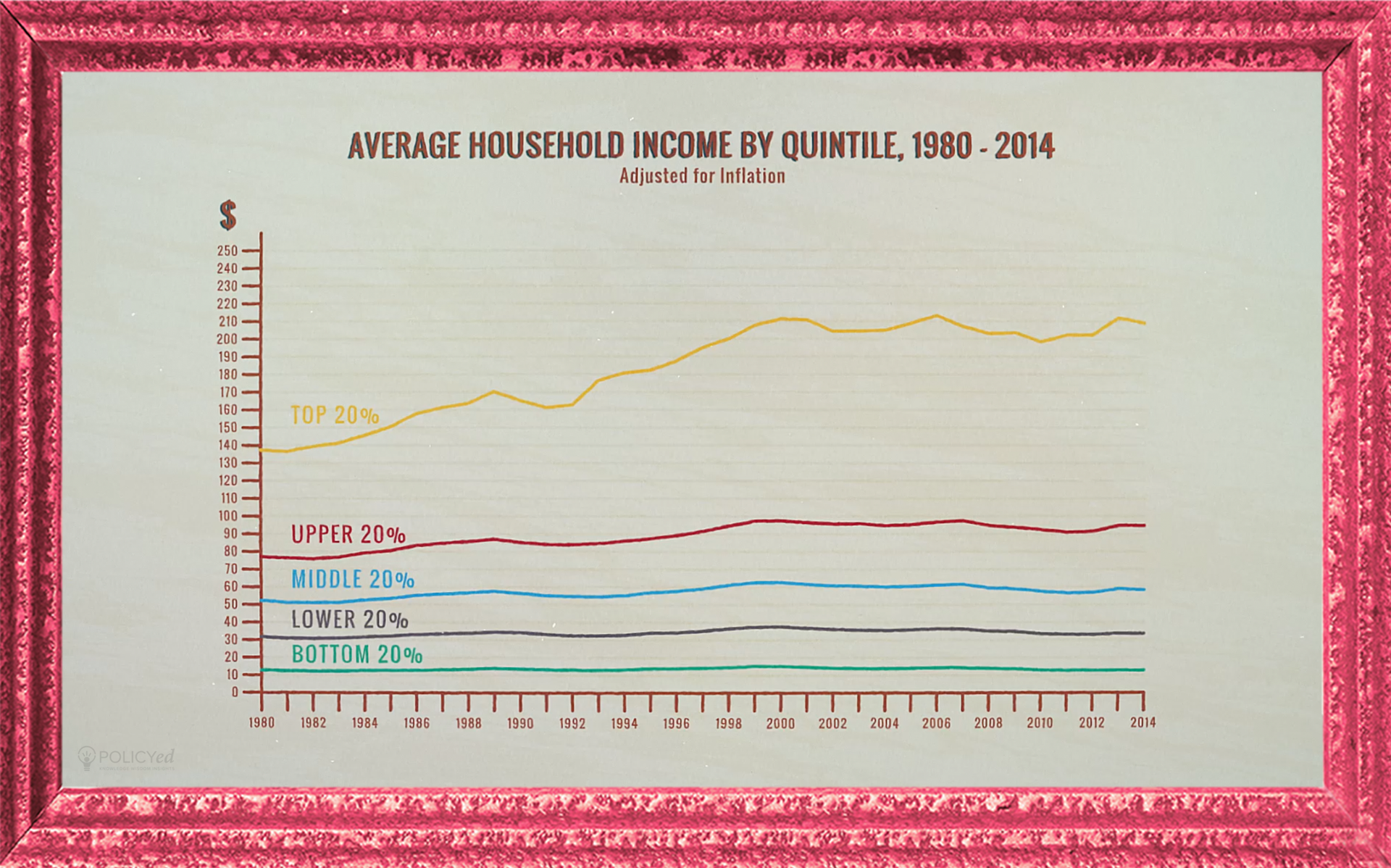
The data in this graph come from the annual Current Population Survey that publishes official data on income and poverty in the United States. Charts like these are used as evidence for the claim that the rich are getting richer and the poor are stuck in place. But as Russ explains in the Numbers Game video, it surveys different people over time. The people who were in the bottom 20% in 1980 were not the same people in the bottom 20% in 2014. Some of them stayed in the bottom 20%, but many increased their incomes and moved to other quintiles.
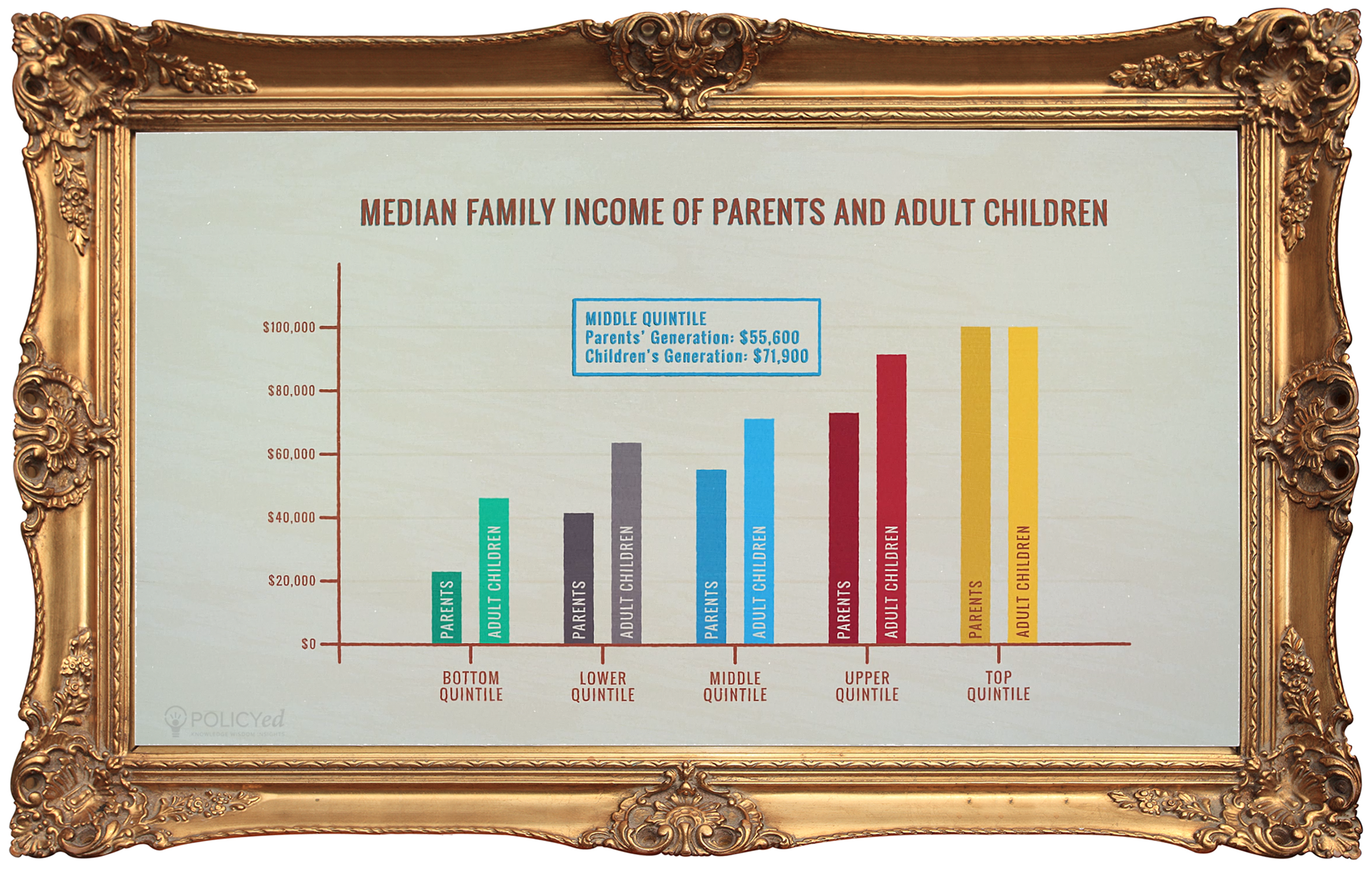
This graph comes from Julia Isaacs’ study “Economic Mobility of Families Across Generations.” It looks at the income of parents and the income of their children once they grow up and reach their parents’ age.
The people who grew up in the poorest households--whose parents had the lowest incomes--ended up with the largest absolute and relative gains in their income over their lives.
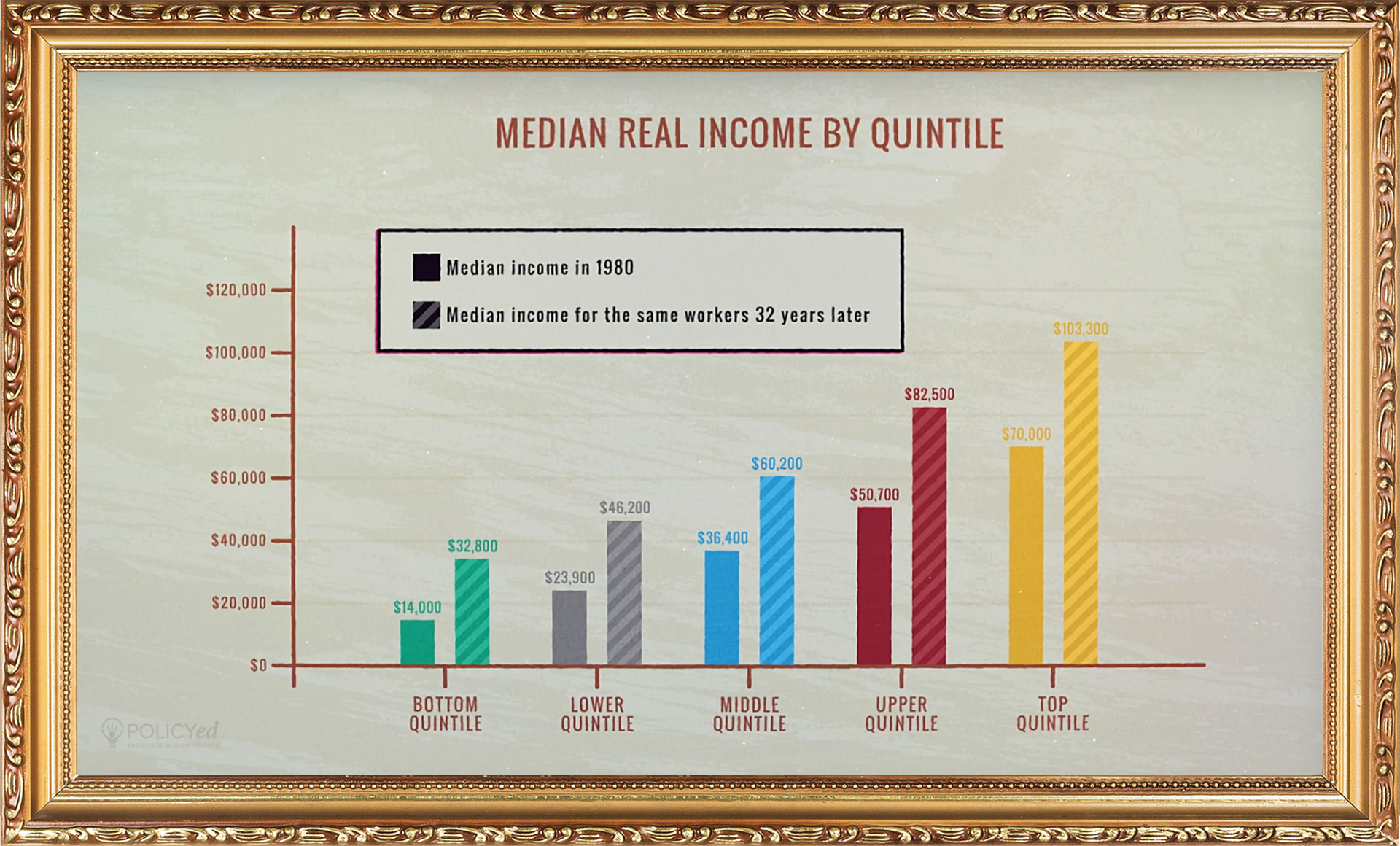
These data from Auten, Gee, and Turner look at income of workers aged 35-40 and then looks at their income twenty years later. Those at the bottom of the income distribution when they were in their mid-thirties went on to double their income twenty years later. Those who were at the top of the income distribution actually lost earnings.
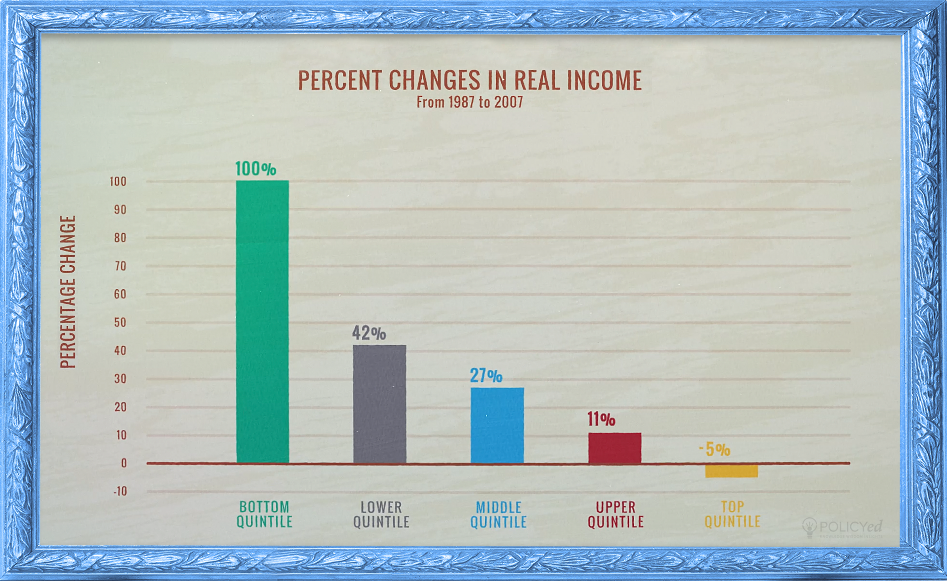
A recent analysis by Yonatan Berman following the same people found that the workers who started in the lowest quintiles had the largest percentage gains. The richest workers had the largest absolute gains but the absolute gains to the poorest workers and those in the middle were not much smaller. In this sample, the rich did indeed get richer and so did everyone else.