Behind the Graphs
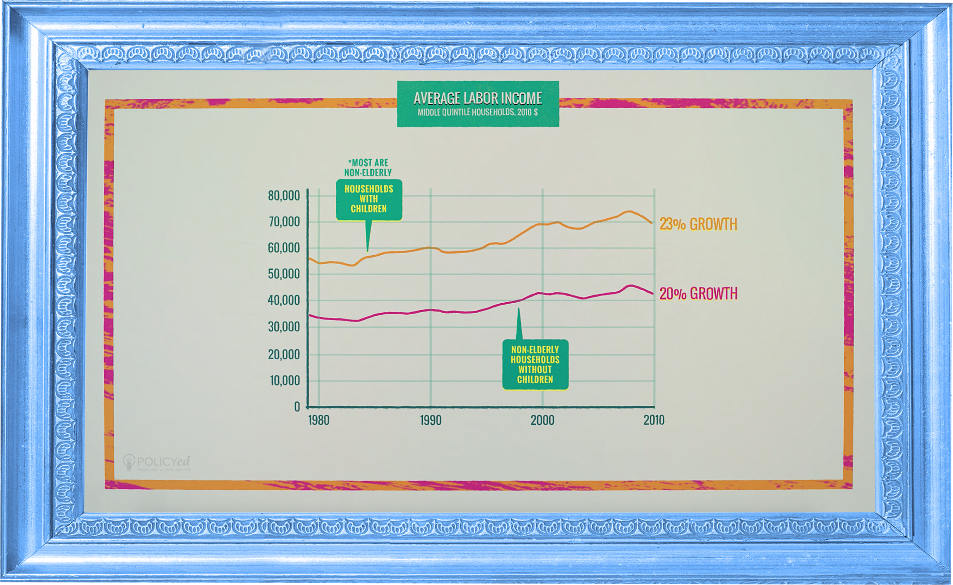
You can find this graph in “How is the Middle Class Doing?”, the first Numbers Game video. It measures income gains from two population groups – households with children and non-elderly households without children. Both have gains above 20%.
But what happens when you take the average of their gains? It should be about 20%, right?
It’s not. That’s because the relative weights of the population changes over time. In other words, the two groups don’t stay the same size relative to one another.
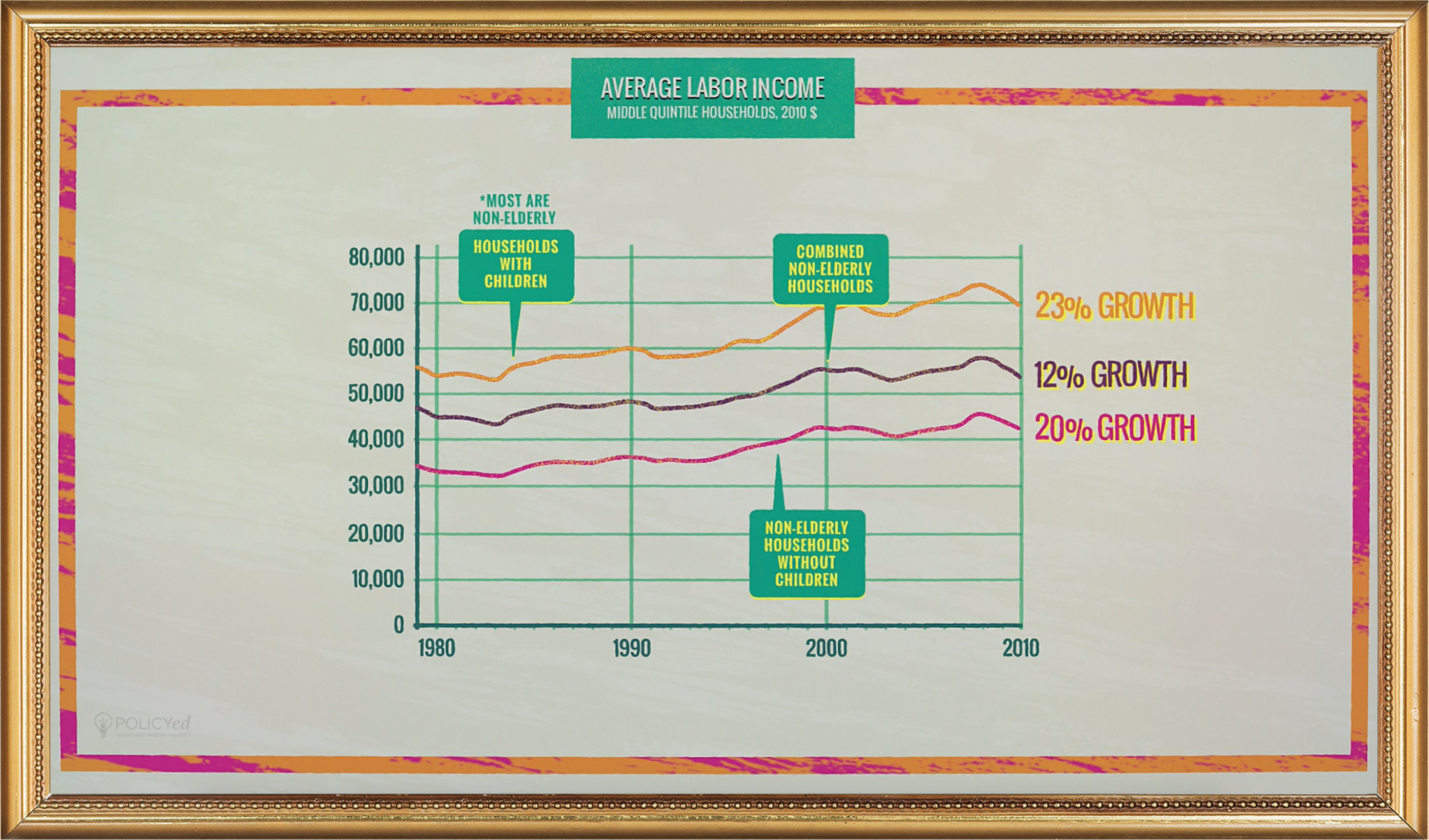
When you average the two population groups, growth is only 12%.
How is that possible? In 1979, there were relatively more people in the households with children group. But in 2010, there were relatively more people in the non-elderly households without children group. That means that the average was pulled upward in 1979 and downward in 2010.
That’s an example of something called Simpson’s Paradox. The change in the average isn’t always the average of the changes.
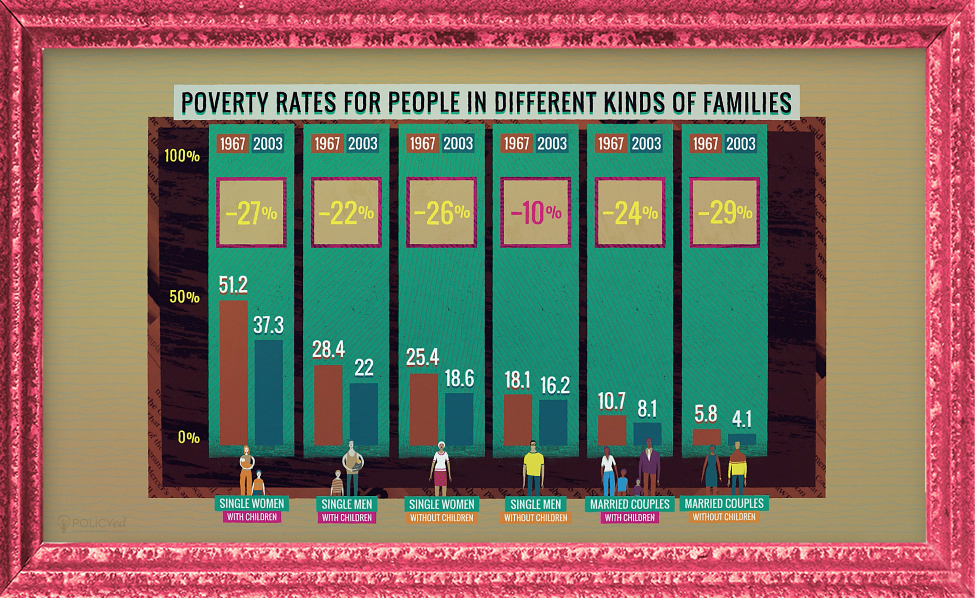
Poverty rates for various kinds of families all fell, mostly by around 20%, from 1967 to 2003. If you took the average of all groups and measured the change, it only comes out to a decline of 4%. How?
That’s because family structure changed dramatically in that time period. The proportion of people in married families with children dropped by 1/3rd, and the proportion of people in families with children headed by single mothers almost doubled. Since they tend to have lower incomes than married families the average income was pulled down, not because people had lower incomes but because the populations changed in size.
If instead the distribution of population groups hadn’t changed size, the drop in the poverty rate would have been 25%.
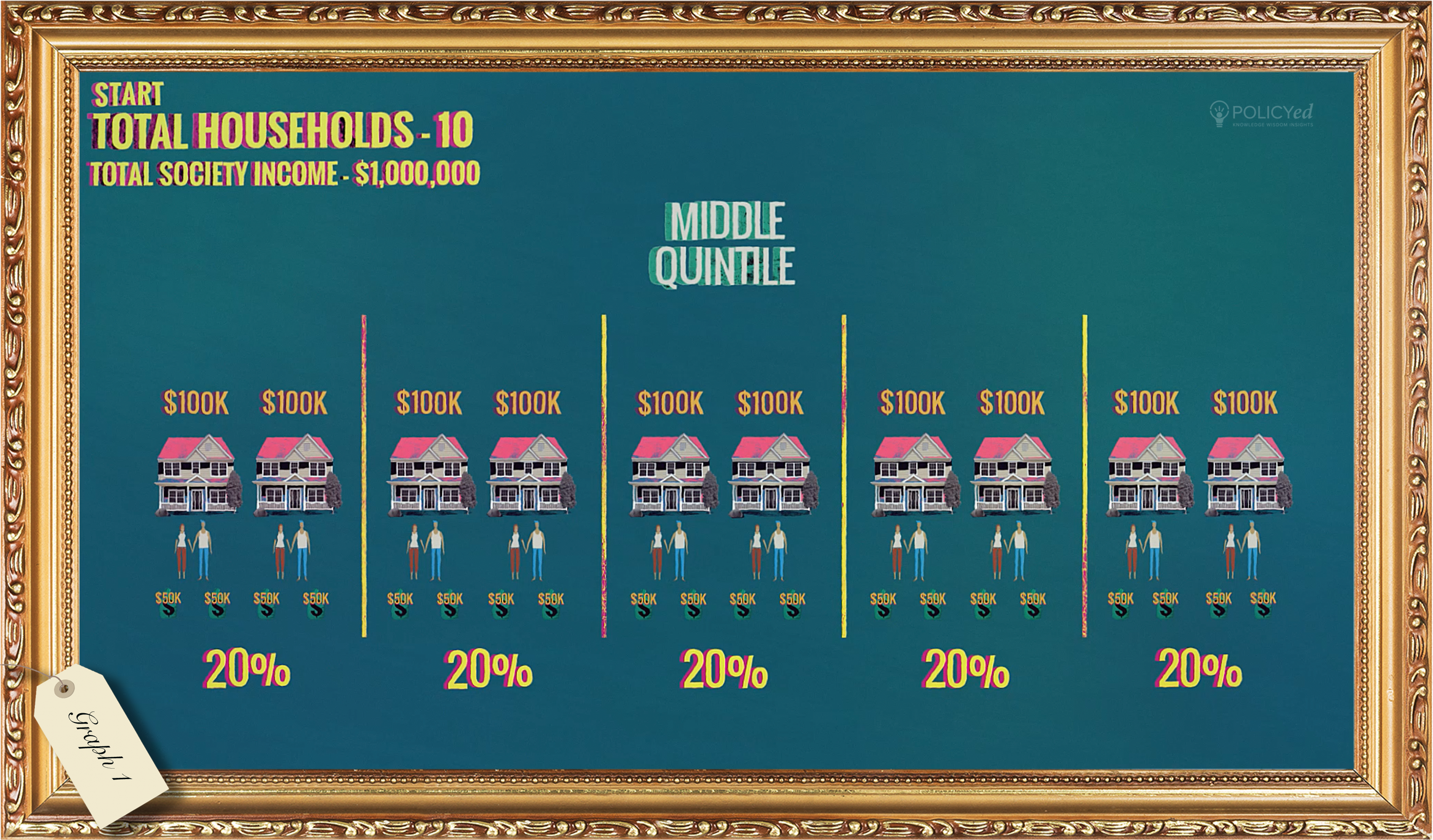
The next three graphs explain how changes in household composition can affect income statistics.
First, imagine that there are ten households that all have married couples, each making $50,000 per year.
Each quintile (20% of the total population) earns exactly 20% of the total income in society.

Then fast forward 30 years later. Each individual’s income has doubled, so that they each make $100,000, but half of the couples have divorced. There are now 15 households, so that each quintile is made up of three households.
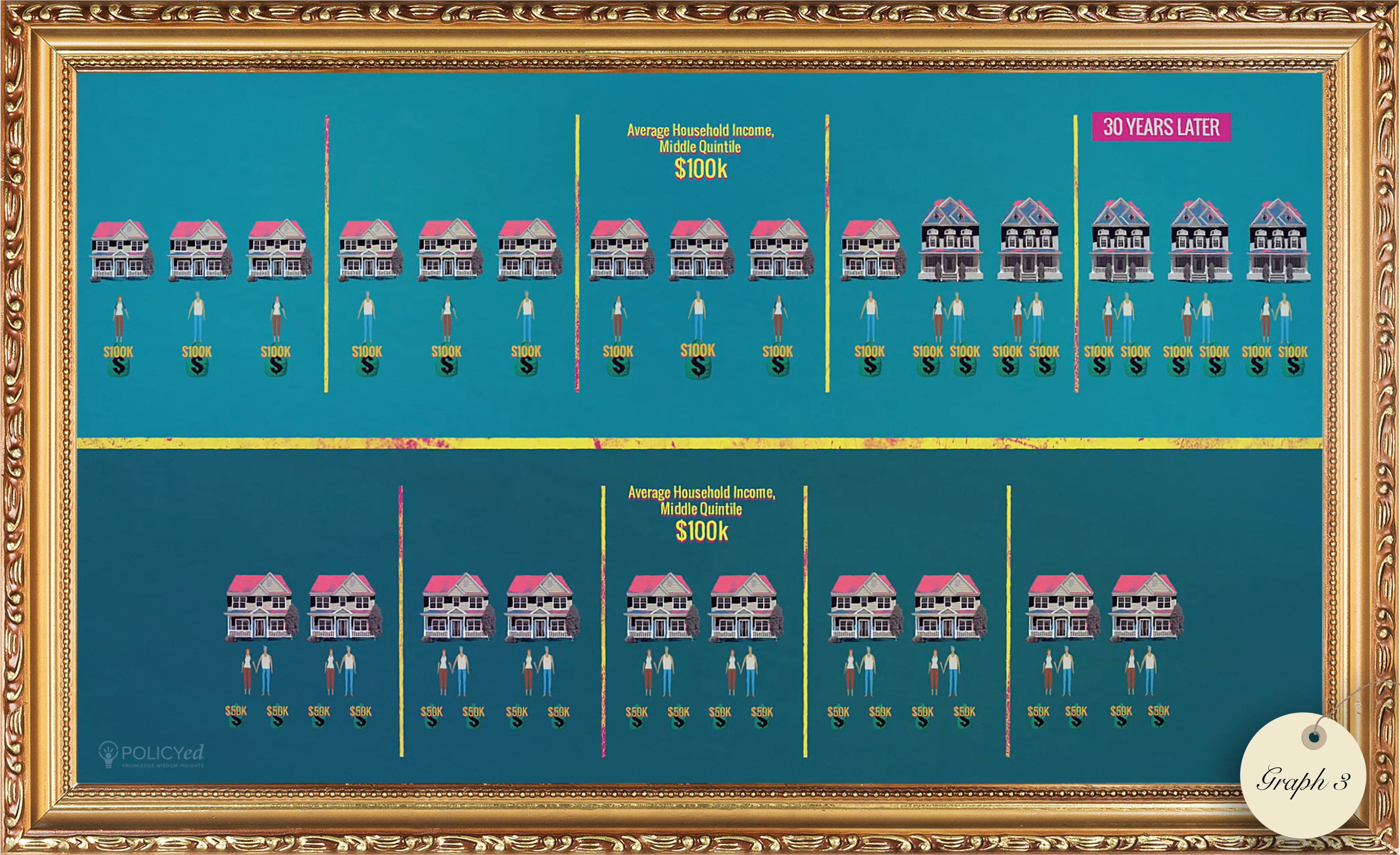
What has happened to the income share earned by the middle quintile? Thirty years ago, it was 20%. Now it is only 15%. “Worse” still, the top quintile now earns 30% of society’s income, a gain of 50%!
And yet, everyone is better off. Every person’s income has doubled.
The share of Americans who are married has been slowly declining for the last fifty years, although it has declined faster for certain groups. An increase in divorce and fewer people getting married in the first place means more single earner households. Those households typically earn less than married households, and contribute to distorting income statistics in a negative way.
While these three figures are a stylized example, they illustrate a portion of what has been happening in America for the past few decades. Changes in family structure distort our economic vision when we compare numbers over time.
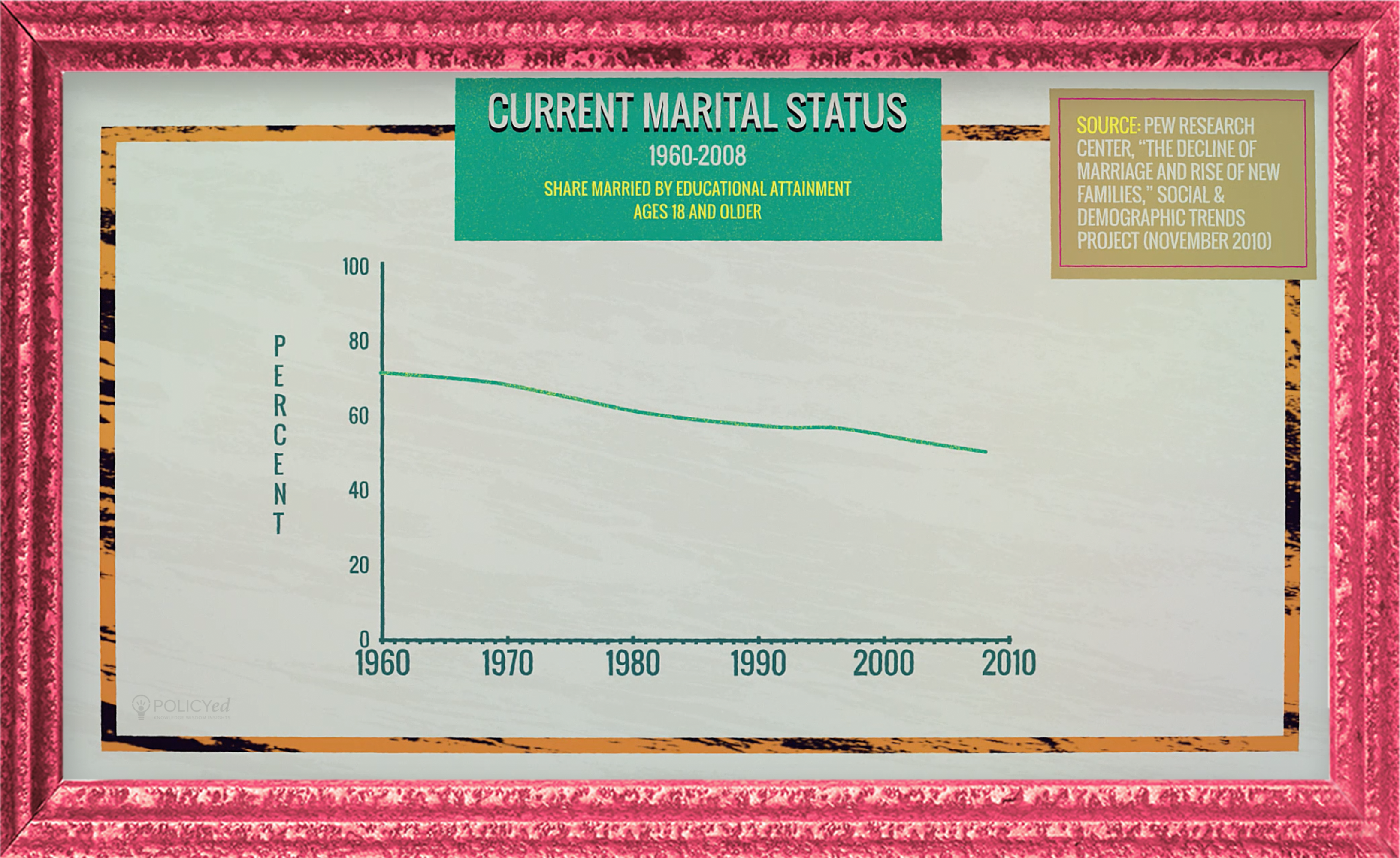
The share of Americans who are married has been slowly declining for the last fifty years, although it has declined faster for certain groups. An increase in divorce and fewer people getting married in the first place means more single earner households. Those households typically earn less than married households, and contribute to distorting income statistics in a negative way.
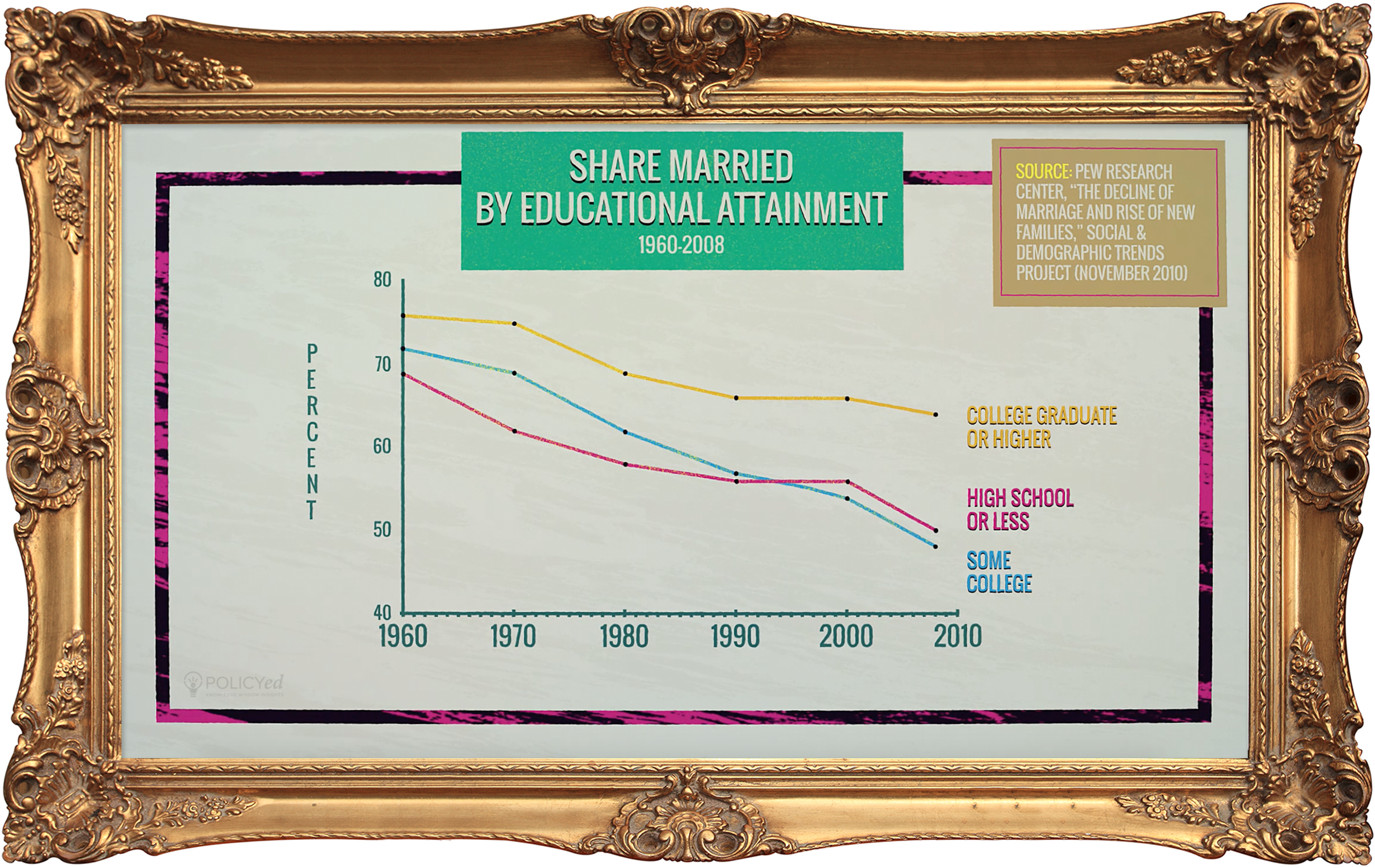
The drop in the marriage rate is much bigger for less educated Americans, which means more low income households in the data. Not because the economy is doing poorly, but because less educated people who earn less are less likely to get married.
That can pull the middle down, not because people are doing worse, but because marriage is less common among those with the least education.